Floodline: A Palantir-Style Flood Response Platform with Assisted AI
One operating picture for cutting evacuation decision time during a flood.
01 — the problem
decisions made on a partial picture
flood data is scattered. water levels, road closures, vulnerable residents, field-team locations: all in separate systems, arriving faster than one person can piece together. decisions get made late, or on a partial picture.
grounded in UK parliamentary flood resilience reviews and Local Resilience Forum reports. not invented.
02 — the user
a coordinator, deciding under pressure
a council emergency planning officer, working from a control room during a flood. they coordinate multiple agencies at once.
goal
see the whole picture fast, decide evacuation priorities, keep teams aligned
pain
scattered data, data overload, slow phone-based coordination
pressure
lives and property at stake, accountable for the outcome
03 — discovery
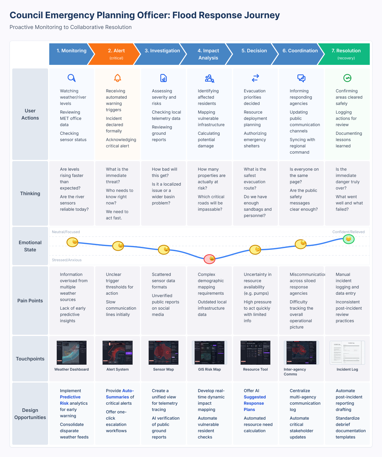
the journey map found the pressure point
mapped the full response across seven stages: Monitoring → Alert → Investigation → Impact Analysis → Decision → Coordination → Resolution.
Impact Analysis is the emotional low point, the moment the scale of the flood becomes clear. that made it the hero screen.
04 — analysis
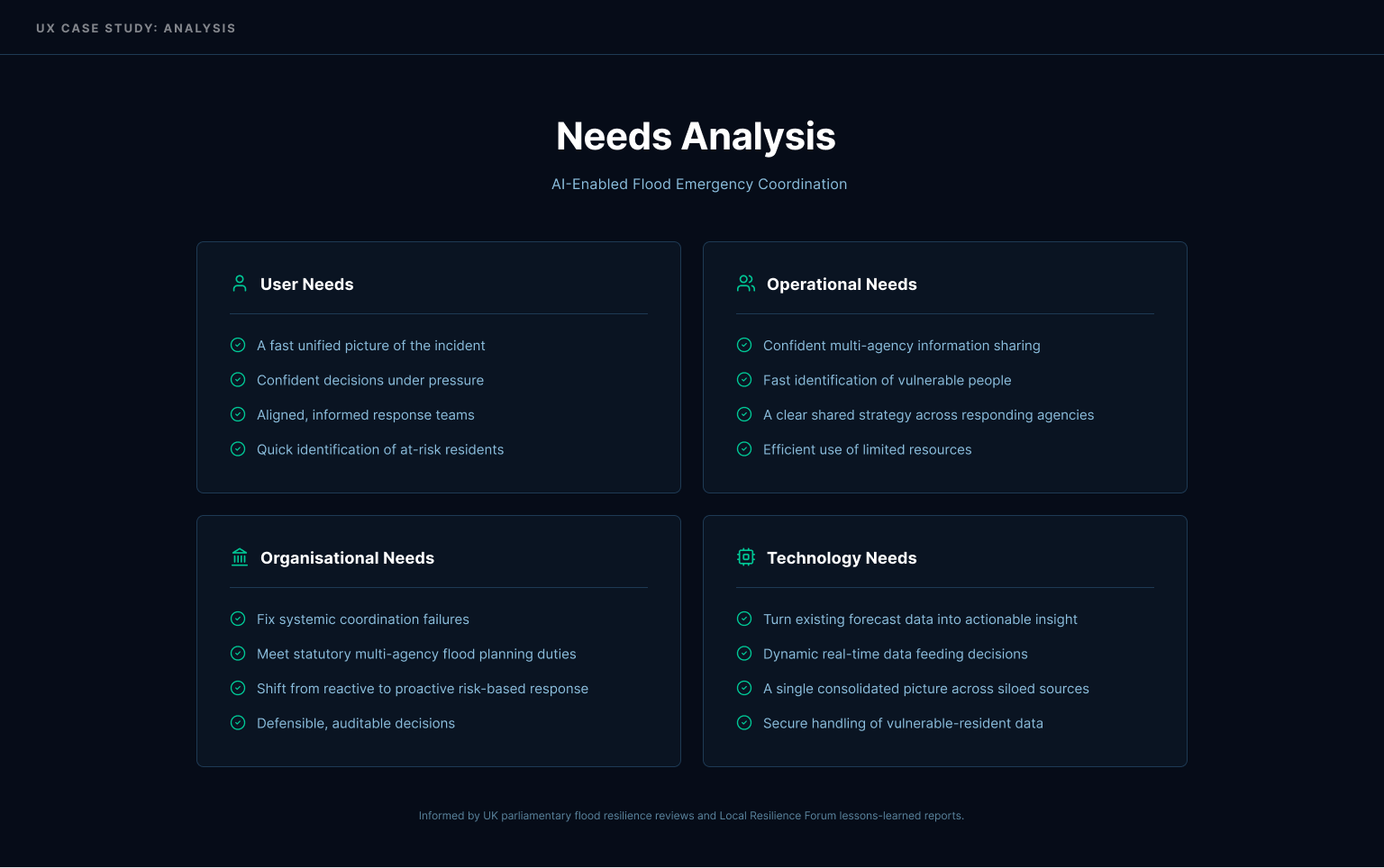
four layers, not just the user
user. operational. organisational. technology. each grounded in the same research.
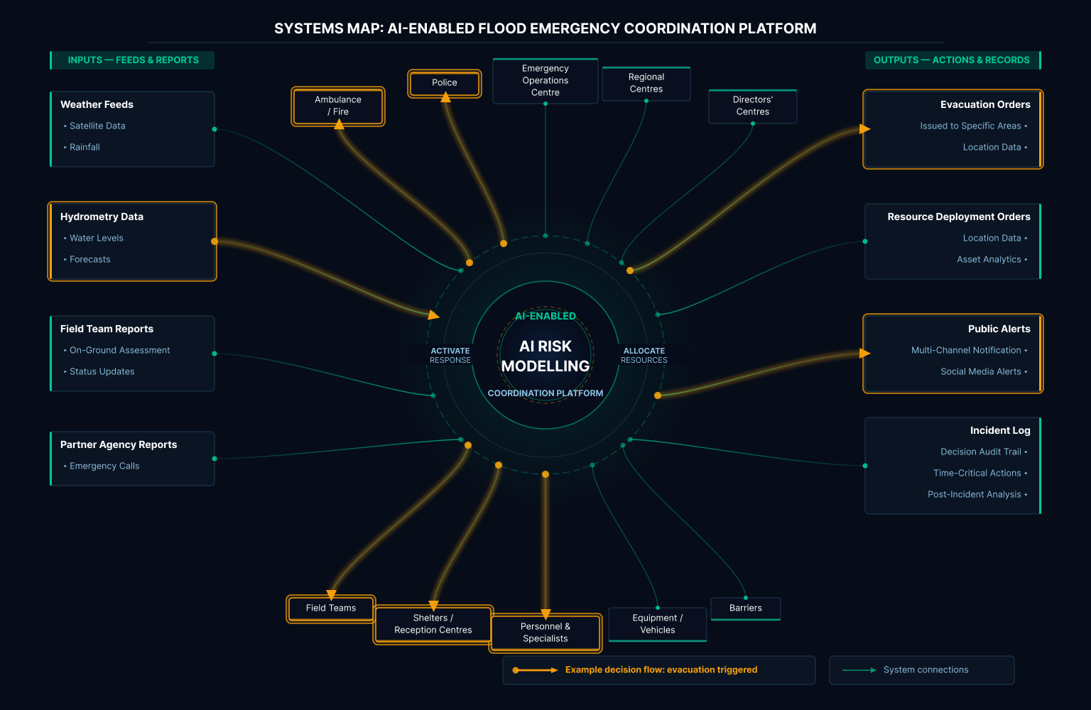
a systems map traced how sensor data, public feeds, and field reports flow in, how the AI layer processes them, and how one decision, evacuate Zone X, ripples out to agencies, resources, and the public.
05 — concept
a dedicated AI panel. clarity over convenience.
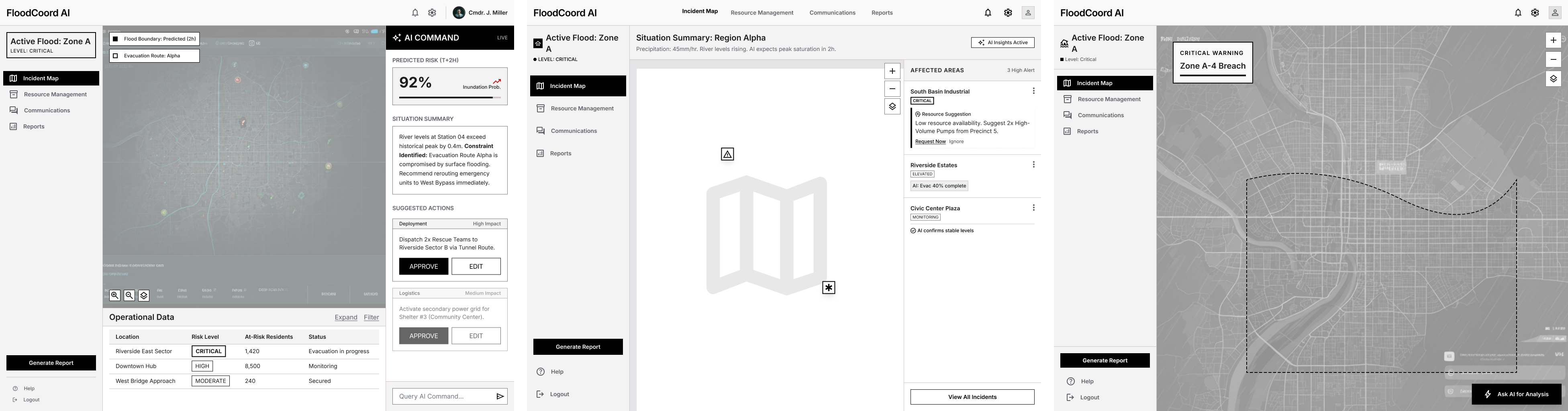
three options: a dedicated AI panel (A), AI woven inline (B), AI on demand (C).
chose A. in an emergency, the officer needs to know instantly: fact or machine suggestion. costs some screen space. worth it.
Option A: dedicated panel
AI always visible, separated from the data. strength: officer always sees AI input, clear what's AI vs raw data. weakness: split attention between panel and map.
Option B: inline
AI attached to the relevant data. strength: suggestions in context, less hunting. weakness: can clutter, harder to tell AI from fact, risk of over-trusting AI woven into the data.
Option C: on demand
AI hidden until requested. strength: clean, officer stays in control. weakness: in a fast incident, hidden help may not get used when it's needed most.
why A wins
in a high-pressure emergency, the officer needs AI visible but clearly distinct from verified data: that separation is what responsible AI requires, knowing what's a machine suggestion vs confirmed fact.
06 — design
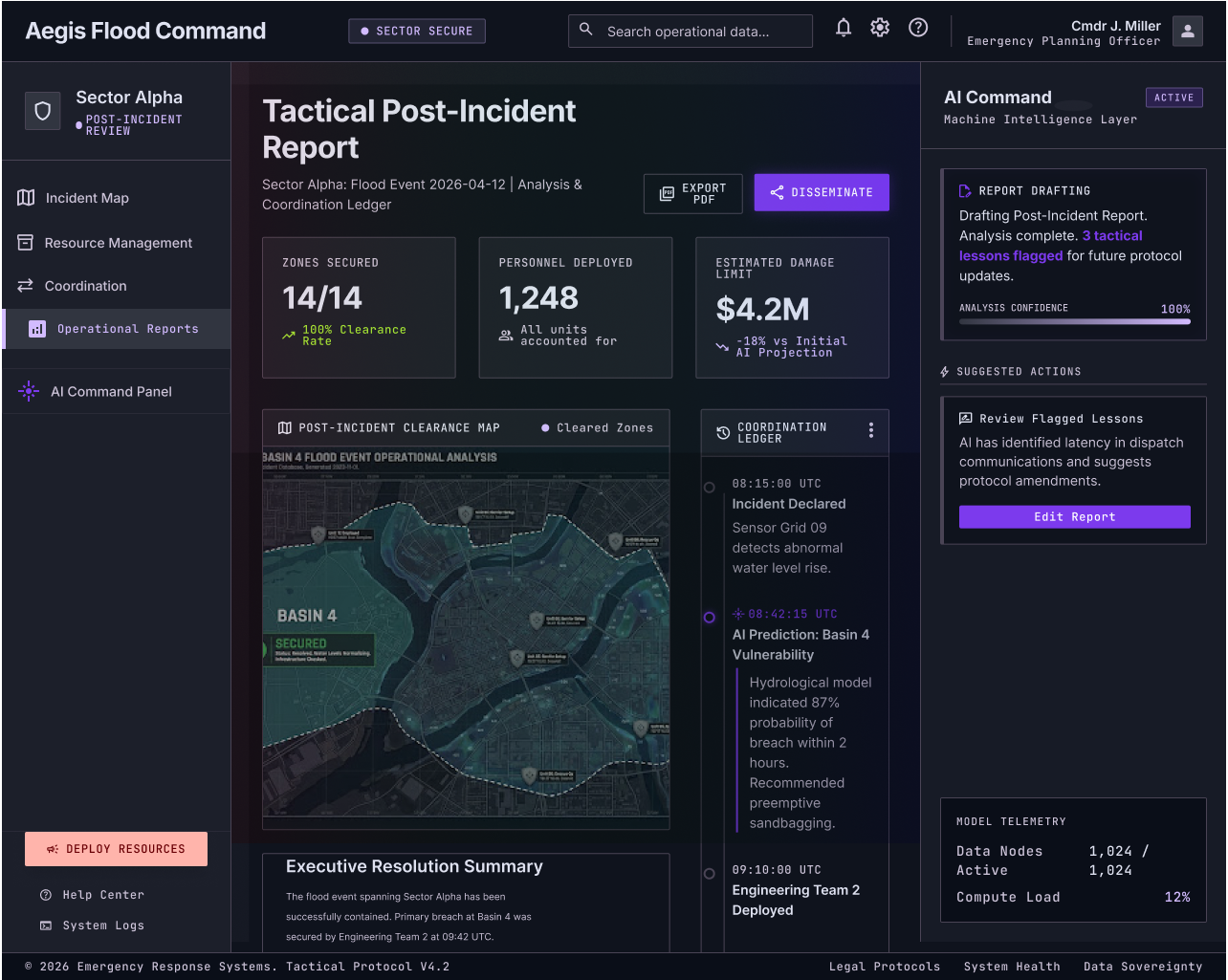
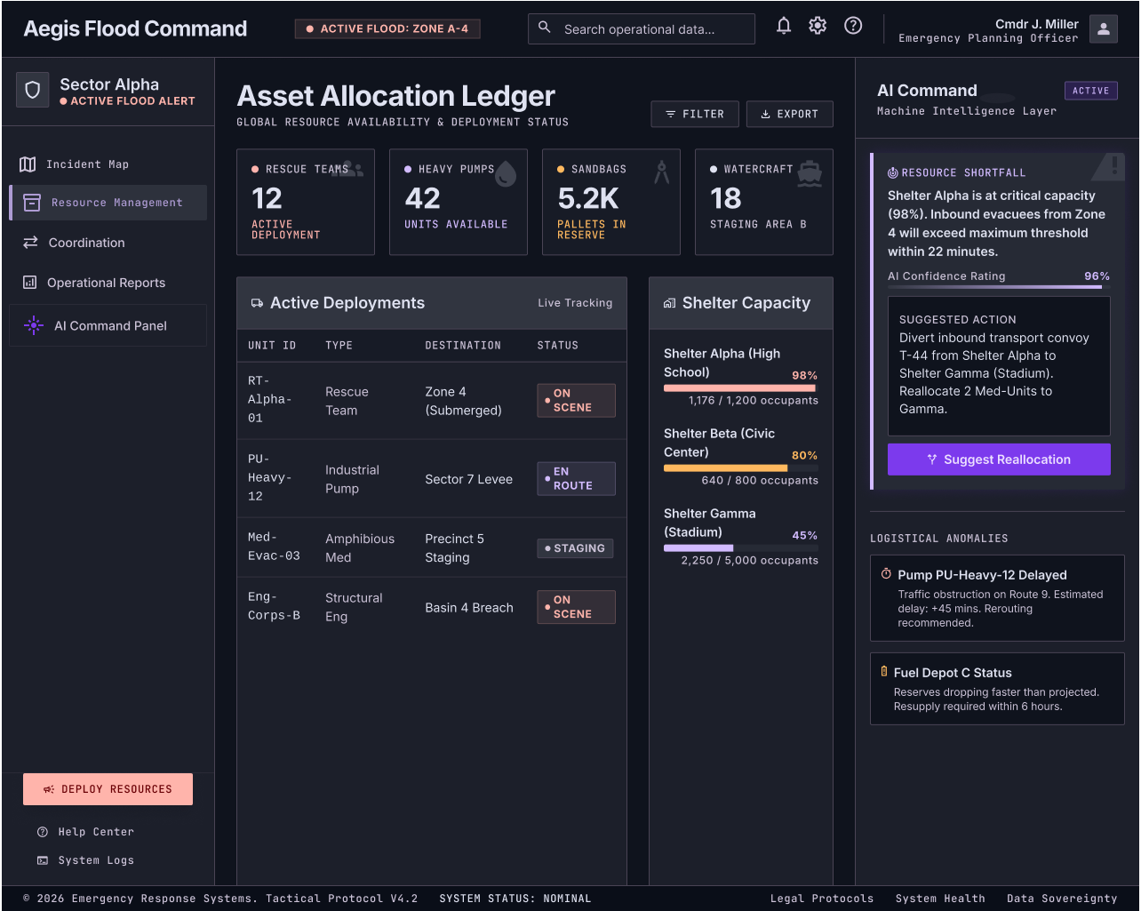
six screens. one rule: ai suggests, human decides.
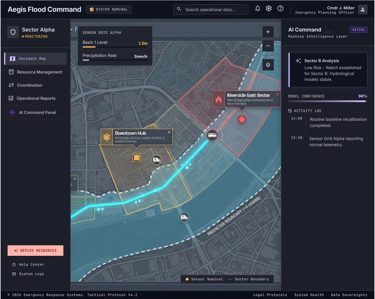
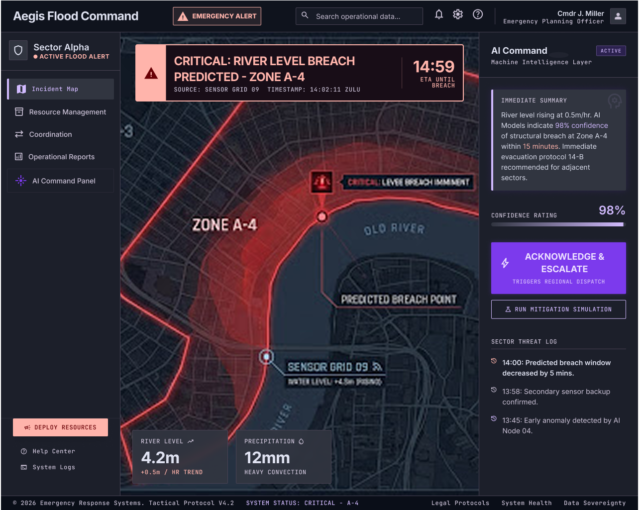
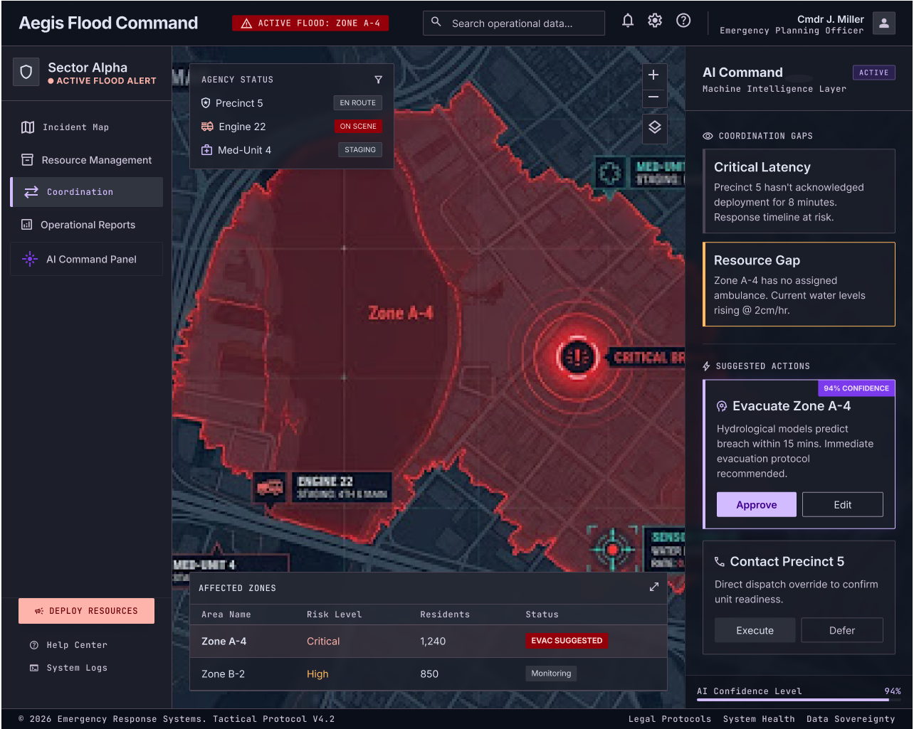
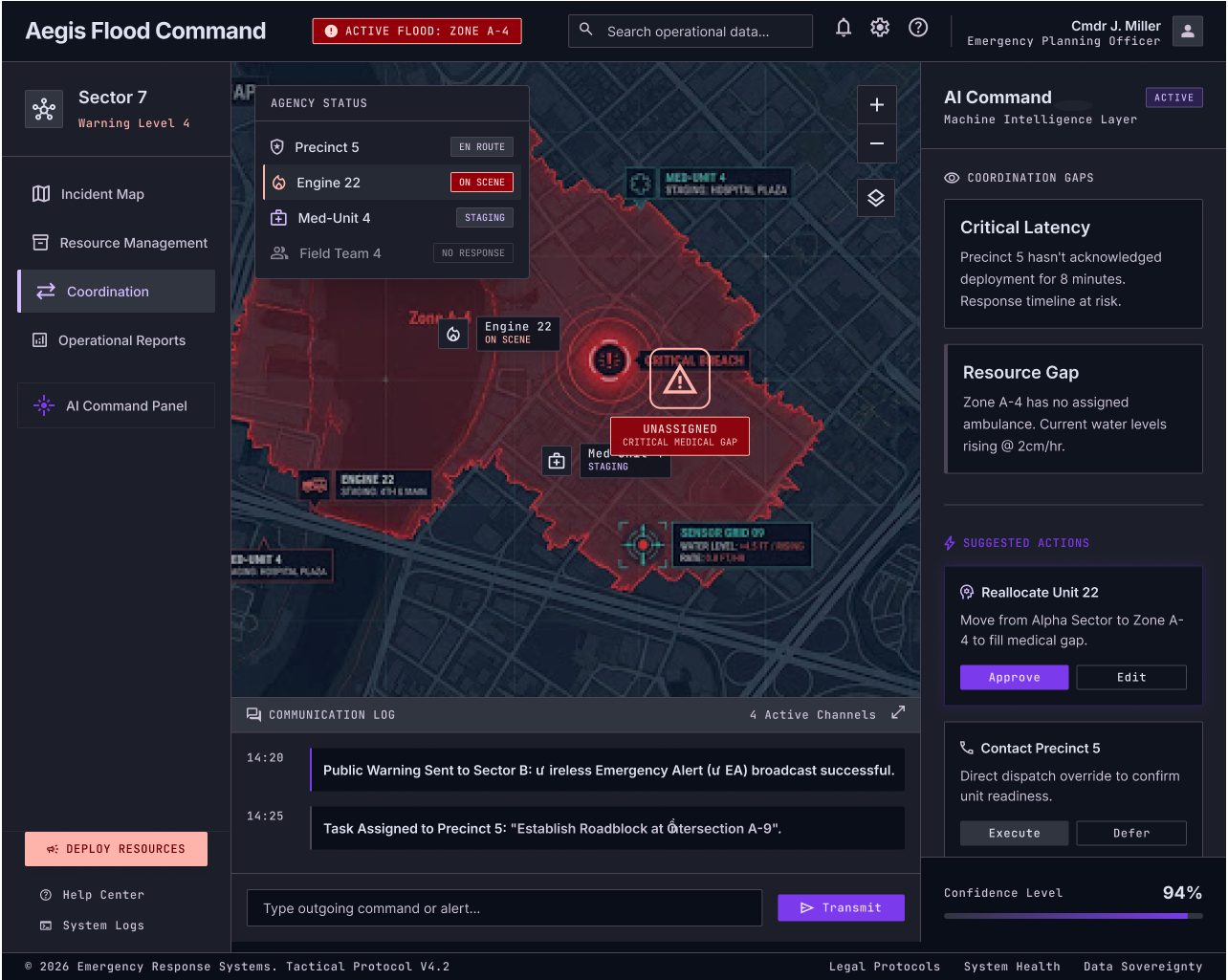
monitoring, alert, impact analysis/decision (hero), coordination, resolution, resource management.
dark, map-centric UI. red and amber reserved for severity only. every AI suggestion carries a confidence rating and an approve/edit control. nothing acts on its own.
07 — responsible ai
the officer stays in control
every AI suggestion: marked as AI, rated for confidence, approved by a human before anything happens.
not a compliance checkbox. a wrong automated call here doesn't mean a bad recommendation, it means people might not evacuate in time.
08 — accessibility
built to scan, not read
high contrast for control-room conditions. status states that don't rely on colour alone. map labels legible at a glance.
09 — validation
the plan, since this is a concept
no testing run yet. the plan: live-incident task with emergency planning officers: "a flood alert has come in, decide evacuation priorities." measure whether they find and verify AI suggestions, and how long it takes them to decide.
10 — what's next
what i learned
the hardest problem wasn't the AI, it was density versus calm legibility under pressure.
next: pressure-test the responsible-AI pattern when someone's actually rushed. and bring Resource Management up to the same fidelity as the hero screen.